

Safety Communication With Data Visualization Infographic

Whether you're a seasoned safety professional or new to the field, mastering data visualization can dramatically enhance your communication effectiveness.
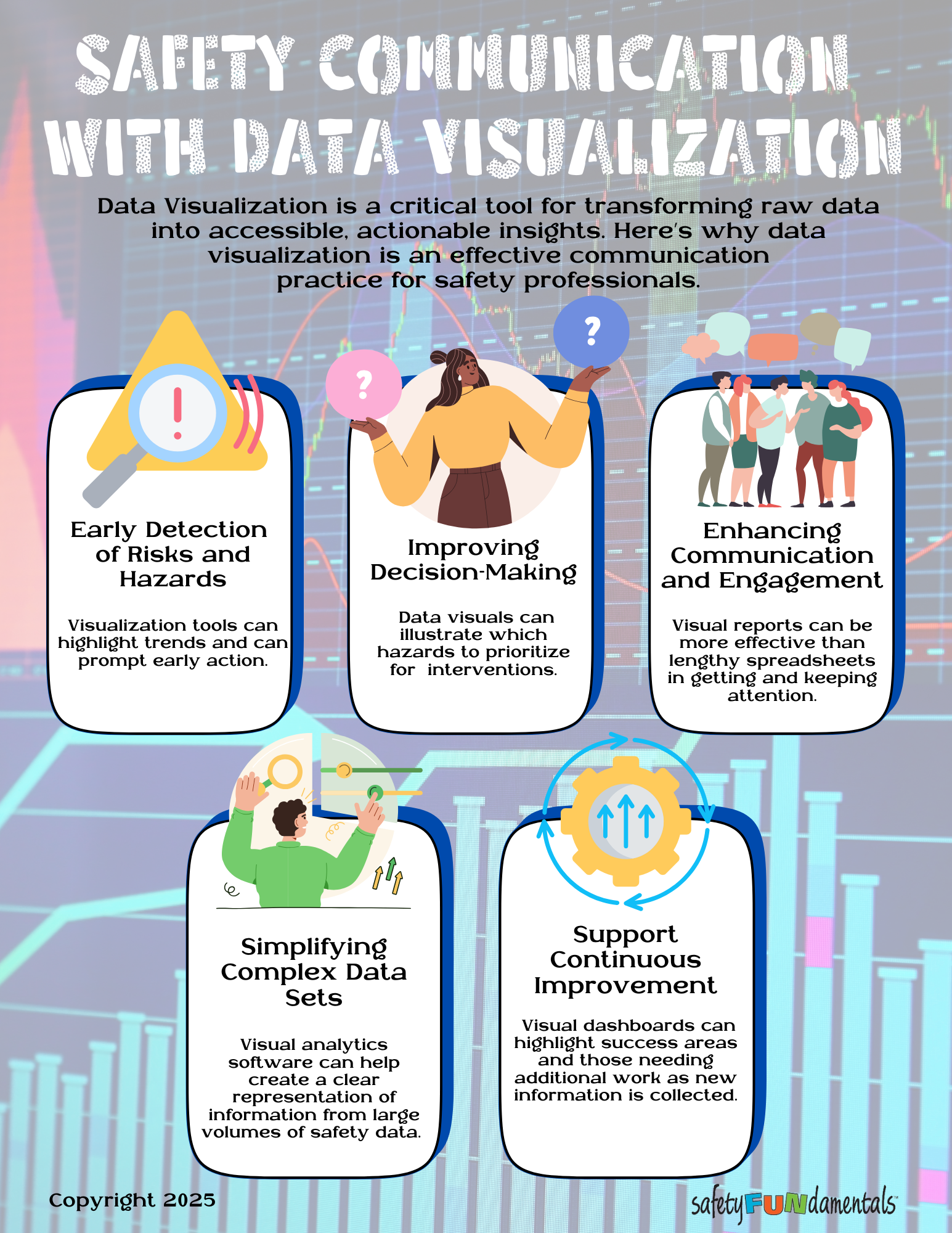
Data visualization refers to the graphical representation of information and data using visual elements like charts, graphs, and maps that provide an accessible way to understand trends, outliers, and patterns.
Effective Data Visualization Can:
- Spot Problems Before They Escalate: Effective visualization tools highlight emerging trends that might go unnoticed in spreadsheets. You can identify potential hazards before they result in incidents.
- Help Make Better Safety Decisions: When you can visually compare different types of hazards and their impacts, prioritizing your interventions becomes much clearer. Visual data helps you allocate your limited resources where they'll have the greatest impact on safety outcomes. This evidence-based approach strengthens your recommendations to management.
- Capture and Maintain Attention: Let's be honest - nobody gets excited about reviewing spreadsheets! Visual reports engage stakeholders in ways that numbers alone cannot. Colorful charts and interactive dashboards make safety data more accessible and memorable, increasing the likelihood that your message will resonate and inspire action.
- Simplify Complex Information: Modern visual analytics software can transform overwhelming volumes of safety data into clear, understandable representations. You don't need to be a data scientist to create powerful visualizations that tell compelling safety stories. These tools help you cut through the noise and focus on what matters.
- Drive Continuous Improvement: Visual dashboards that update as new information is collected provide real-time feedback on your safety initiatives. They clearly highlight both success areas and those requiring additional attention, creating a transparent framework for ongoing improvement and accountability.
Whether you're presenting to executives or frontline workers, incorporating data visualization into your safety communications can dramatically increase your effectiveness and influence. The right visual can be worth more than a thousand words when it comes to promoting safety!
Leave a comment
Comments will be approved before showing up.
Also in SafetyFUNdamentals Blog


The Hidden Link Between Fraud and Workplace Accidents
Workplace fraud and unsafe acts, despite having different consequences, are both driven by the same three underlying human dynamics: pressure, opportunity, and rationalization.
