

The Coronavirus Image
A recent article in Popular Mechanics talked about how the coronavirus image we are all so used to seeing by now was created by the CDC and while reading it, I noticed several key facts related to the use of images in safety training.
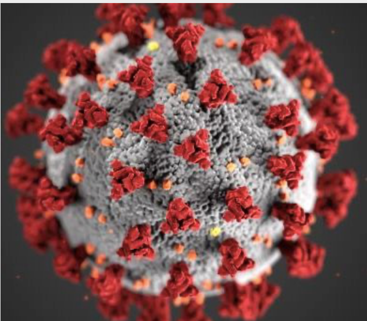
Image courtesy of CDC
- The 3D image shown above of the coronavirus is artificially colored to make it more effective. The artists stated that they chose red on gray to make the image stand out. Have you ever used color to get your message across? I wonder how people would respond to the same image if it was pink and baby blue. Or, if the image was all one color. Would it have the same effect? Doubtful.
- Before creating the 3D image, the artists spoke with experts to gather information on what the virus looks like up close and learned there are 3 kinds of proteins that do different jobs. Like images used in safety training, it is important to use photos and illustrations that are the same or very similar to the idea you want to get across. Knowing key details about what you are trying to explain, and making sure those key details are included in the image, is very important.
- The texture was selected to look like orange skin and helps the model seem touchable. Why is it important if the virus seems touchable? Imagine if the model of the coronavirus shown was simply a wooden model that looked like something you might have built back in a high school chemistry class. Making the surface seem touchable, and even something you are familiar with like orange skin, makes the virus more realistic. Realistic photos not only stay in our mind longer but help us to make sense of how this little gray ball with red bumps can do so much harm.
- If you search for "coronavirus image" you will get over 10 Billion results! This image or something very similar is shown with many of the coronavirus stories published, especially in items published during the beginning of the pandemic. Just like good communication in safety training, illustrations, or photos of complex ideas are key to getting attention and helping to explain complicated ideas and information. Text with accompanying related images do a much better job of getting key information across.
When you are creating your next safety training materials, make sure you pay attention to the images you use and what message they get across. You may have to create something yourself or hire someone to help you get exactly what you need. Remember, a picture is worth a thousand words.
Leave a comment
Comments will be approved before showing up.
Also in SafetyFUNdamentals Blog


The Hidden Link Between Fraud and Workplace Accidents
Workplace fraud and unsafe acts, despite having different consequences, are both driven by the same three underlying human dynamics: pressure, opportunity, and rationalization.
